Tutorial
This tutorial will run through some very basic examples of how to do a few
interesting things with the hyperspy_tools.plotting,
hyperspy_tools.shifting_lines, and hyperspy_tools.eels modules.
The code in this section is also available as a Jupyter
notebook (possibly outdated),
for interactive evaluation.
Getting Started
Download the tutorial
filesand extract them to a folder.Install the dependencies and the
hyperspy_toolsmodule following the Installation instructions.Fire up a Python (or Jupyter or Notebook) instance, and import the module packages (we also set up a bit of formatting code):
>>> import hyperspy.api as hs
>>> import hyperspy_tools.plotting as htp
>>> import hyperspy_tools.shifting_lines as hts
>>> import hyperspy_tools.eels as ht_eels

>>> # Set some display preferences:
>>> import seaborn as sns
>>> sns.set_style('white',
...               rc={"image.cmap": 'cubehelix',
...                   'legend.frameon': False,
...                   "lines.linewidth": 1})
>>> sns.set_context('poster', font_scale=1.2)

>>> import matplotlib.pyplot as plt
Plotting survey images from DigitalMicrograph
One of the more useful methods in the hyperspy_tools.plotting
package is plot_dm3_survey_with_markers().
HyperSpy currently does not load the annotations present on survey images
that are saved by DigitalMicrograph. These annotations show where
the beam was located, from where a spectrum image was acquired, and where
the spatial drift correction was performed.
plot_dm3_survey_with_markers() will load
this information from the .dm3 tags, and plot it in a manner consistent
with HyperSpy:
>>> htp.plot_dm3_survey_with_markers('survey_image.dm3')
See the detailed documentation of plot_dm3_survey_with_markers()
for more information about the different options for plotting.
Customizing plot outlines and colorbars
A few methods are included that are useful for plotting images:
add_colored_outlines() will outline images
with colored borders (useful for matching up with plots of spectra), and
add_custom_colorbars() will easily add colorbars
to image plots with ticks at specified locations. A simple demonstration:
>>> eels_sig = hs.load('EELS_signal.hdf5')
    # This spectrum already had a decomposition performed...
>>> loadings = eels_sig.get_decomposition_loadings()
>>> hs.plot.plot_images(loadings,
...                     axes_decor=None,
...                     per_row=3,
...                     label=['Loading {}'.format(i) for i in range(3)],
...                     colorbar=None)
Add the colored outlines:
>>> htp.add_colored_outlines(fig=plt.gcf(),
...                          signal=eels_sig,
...                          num_images=3,
...                          border=0,
...                          lw=15)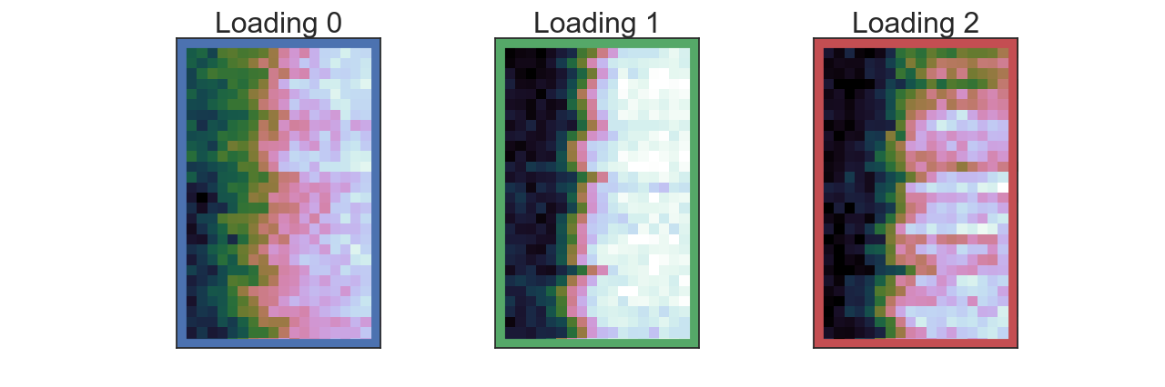
Add the custom colorbars:
>>> # Little helper function to calculate middle of tick_list easily
>>> def avg_list(i, j):
>>>     return [i, (i + j)/2, j]

>>> # add the colorbars
>>> htp.add_custom_colorbars(fig=plt.gcf(),
...                          tick_list=[avg_list(16, 28),
...                                     avg_list(-21, 0),
...                                     avg_list(0, 12)])
Correcting spatial drift
When collecting a spectrum image across a planar interface, spatial drift during the acquisition can cause the interface to appear slanted or jagged. Spatial drift correction methods in the acquisition software help, but are not always perfect.
The hyperspy_tools.shifting_lines module provides a simple
means to correct this drift, using the STEM signal that is collected at the
same time as the spectrum image. The small example presented here will
demonstrate the process:
Load the STEM signal and the spectrum image:
>>> stem = hs.load('STEM_signal.dm3')
>>> eels = hs.load('EELS_signal.hdf5')
The
get_shifts_from_area_stem()method will extract individual line profiles from the STEM image, find the midpoint of the intensity, and report what spatial shift is necessary to bring that midpoint to an average coincident point with all the other profiles. The method returnsstem_linescans(a list of the extracted line profiles) andshifts(the array of shift values):>>> stem_linescans, shifts = hts.get_shifts_from_area_stem(stem, ... debug=False)
If the
debug=Trueoption is provided, a scatter plot of the measured midpoints will be shown:
The
shiftsarray now contains all of the shifts necessary to bring all the scans together:>>> shifts array([-0.2715, -0.4605, -0.1705, -0.3105, -0.3635, -0.0135, -0.1235, -0.3245, -0.3675, 0.0135, 0.4585, 0.3345, 0.1745, -0.5165, 0.0515, -0.1095, -0.2035, 0.3415, 0.5375, 0.2265, 0.3655, 0.5255, -0.2275, 0.4275, 0.7455, 0.6245, 0.4805, -0.1155, -0.3335, 0.6915])
The STEM signal can be easily shifted to become planar with the
shift_area_stem()method. HyperSpy’splot_images()method can be used to visualize the results:>>> shifted_stem = hts.shift_area_stem(stem, shifts=shifts) >>> hs.plot.plot_images([stem, shifted_stem], ... suptitle='Shifting STEM images', ... colorbar=None, ... label=['Original', 'Shifted'], ... axes_decor=None, ... scalebar='all')
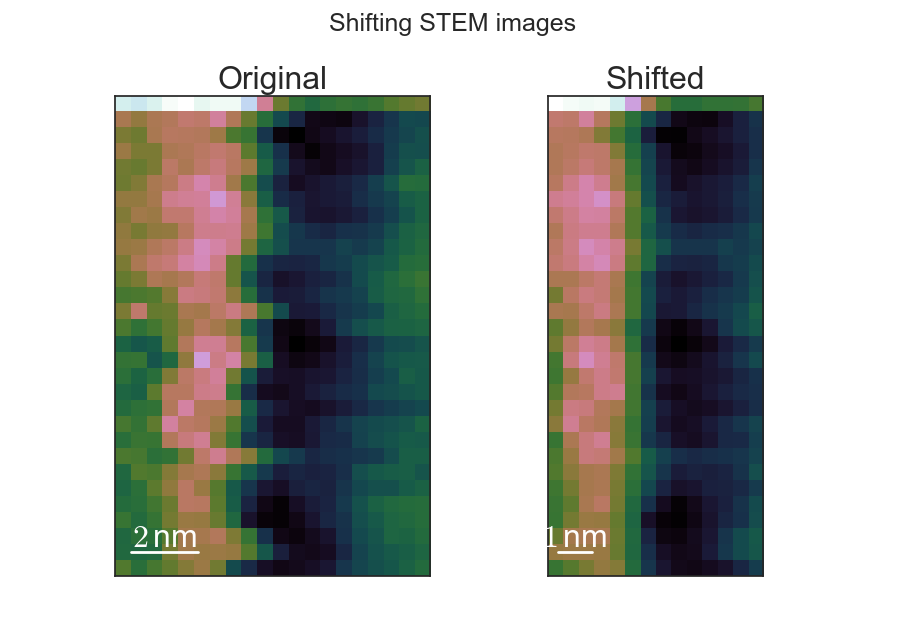
As can be seen, the interface is straightened, and the image was cropped to prevent the presence of empty pixels in the image. If desired, the
crop_scanparameter can be set toFalse, and the image will not be cropped.An analogous method
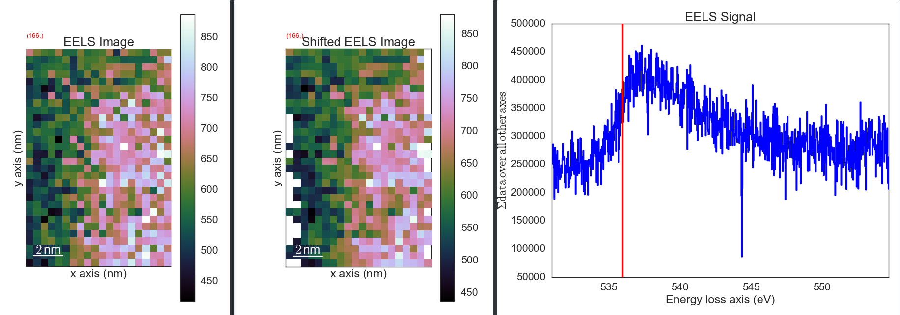
shift_area_eels()allows for a similar operation on EELS spectrum images as well. The HyperSpyplot_signals()function can compare the results:>>> # Do not crop the scan so we can see the empty pixels: >>> shifted_eels = hts.shift_area_eels(eels, ... shifts=shifts, ... crop_scan=False) >>> # Plotting as images using the as_image() transformation >>> # (rather than Spectra) makes it easier to see the shift >>> hs.plot.plot_signals([eels.as_image((0,1)), ... shifted_eels.as_image((0,1))])
Correcting energy drift
When collecting a spectrum image across a planar interface, energy drift during the acquisition can cause the peaks in the core-loss region to appear as if they are moving, even when they are not. This can cause significant artifacts in a spectral unmixing process.
Ideally, the zero-loss region of the EELS spectrum would be collected at the
same time, but not all of us have the newest fancy spectrometers capable of
doing this. For the rest of us, the hyperspy_tools.eels module
provides a way to somewhat correct this, given some constraints on how the
spectrum images are collected.
First, the spectrum image should be collected like those above, where there is one uniform material in the first column in every row of the spectrum image. There should also be a feature to align on in this region (the Si-L2,3 or O-K edges have worked in my experience.)
Load the spectrum image (this example uses the O-K edge):
>>> eels = hs.load('EELS_signal.hdf5')
Call the shifting method
align_energy_vertical(), using some additional parameters to improve the result.startandendare used to limit the area used for shift detection to just a feature of interest. This helps make the method more accurate, and also speeds up the processing. The amount of smoothing should be increased above the default if the shifts do not seem to be working (0.1 was necessary for this file, rather than the default 0.05). Specifying theplot_derivoption will enable plotting of the signal derivative in order to see if the data is sufficiently smoothed. Thecolumnargument allows you to specify which column of the data should be used to measure the shift. Since this image does not have any features in the first column, we specify one on the right side (where the O-K edge is) in order to get it to work.>>> aligned_sig = ht_eels.align_energy_vertical(sig, ... column=15, ... start=533.0, ... end=540.0, ... smoothing_parameter=0.1, ... print_output=True, ... plot_deriv=True) Shifts are: [ 0. -0.17 -0.165 -0.215 -0.39499999 -0.085 -0.075 0.09 0.34999999 0.095 0.21 0.215 -0.08 0.195 0.48499999 0.135 0.175 0.11 0.39499999 0.03 0.24499999 0. -0.02 0.45499999 0.64999999 0.145 0.30999999 0.33999999 0.27499999 0.18 ] Max shift: 0.6499999854713678
aligned_sigwill now contain the corrected data, which can be confirmed by comparing>>> sig.plot()
and
>>> aligned_sig.plot()